今週は寒かったですが、来週は1週間真夏日が続くそうで、
なんだかこんなに温度が変化すると体が疲れちゃいますよねー!
GWも終わったことだし今週も風邪ひかずに頑張りましょう!
少し前のブログでCSS Grid Layout Moduleについて記事をかかせていただいてましたが
IEへの対応について特に記載してなかったのでご紹介しようと思います。
CSS Grid Layout Module IE対応はどうするの?
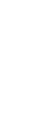
Grid Layoutはすごく便利な反面、IEへはchromeやEdgeと異なる書き方をしないと崩れてしまいます。
たとえば以下のようなレイアウト、chromeやEdgeであれば、次のようなソースで問題ないのですが
IEでは崩れてしまいます。
See the Pen grid css IE解説 by sayuri (@giraffeweb) on CodePen.0
<ul id="season">
  <li><a href="#">赤</a></li>
  <li><a href="#">青</a></li>
  <li><a href="#">黄</a></li>
  <li><a href="#">緑</a></li>
  <li><a href="#">黒</a></li>
</ul>
#season {
	display: -ms-grid;
	display: grid;
	grid-template-columns: 50.5% 25% 25%;
	grid-template-rows: 150px 150px;
}

#season li a {
  display: block;
  text-decoration: none;
  color: #fff;
}

#season li:nth-child(1) {
	grid-row: 1 / 3;
  grid-column: 1 / 2;
	margin-right: 5px;
  background-color: red;
}

#season li:nth-child(2) {
    grid-row: 1;
    grid-column: 2;
	margin-right: 5px;
  margin-bottom: 5px;
  background-color: blue;
}

#season li:nth-child(3) {
    grid-row: 1;
    grid-column: 3;
	margin-bottom: 5px;
  background-color: yellow;
}

#season li:nth-child(4) {
    grid-row: 2;
    grid-column: 2;
	margin-right: 5px;
  background-color: green;
}


#season li:nth-child(5) {
    grid-row: 2;
    grid-column: 3;
    background-color: #000;
}
IEに対応する場合は次のようなソースを上記のcssに追加します。
#season ul {
	display: -ms-grid;
	display: grid;
	grid-template-columns: 50.5% 25% 25%;
	grid-template-rows: auto auto;
	-ms-grid-columns: 50.5% 0 25% 0 25%;
	-ms-grid-rows:200px 0 200px;
}

#season ul li:nth-child(1) {
  	-ms-grid-row: 1;
  	-ms-grid-column: 1;
	grid-row: 1 / 3;
      grid-column: 1 / 2;
	margin-right: 5px;
}

#season ul li img {
	display: block;
	width: 100%;
}

#season ul li:nth-child(2) {
   -ms-grid-row: 1;
   -ms-grid-column: 3;
    grid-row: 1;
    grid-column: 2;
  margin-right: 5px;
}

#season ul li:nth-child(3) {
   -ms-grid-row: 1;
   -ms-grid-column: 5;
    grid-row: 1;
    grid-column: 3;
  margin-bottom: 5px;
}

#season ul li:nth-child(4) {
   -ms-grid-column: 3;
   -ms-grid-row: 3;
    grid-row: 2;
    grid-column: 2;
	margin-right: 5px;
}


#season ul li:nth-child(5) {
   -ms-grid-column: 5;
   -ms-grid-row: 3;
    grid-row: 2;
    grid-column: 3;
}
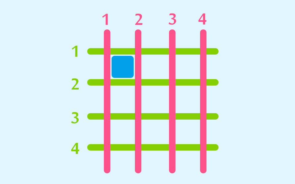
-ms-を追加したり、書き方を変更する必要がある
grid-row は -ms-grid-column に
grid-column は -ms-grid-row に
また
grid-template-columns は -ms-grid-columns に
grid-template-rows は -ms-grid-rows に
書き換えます。
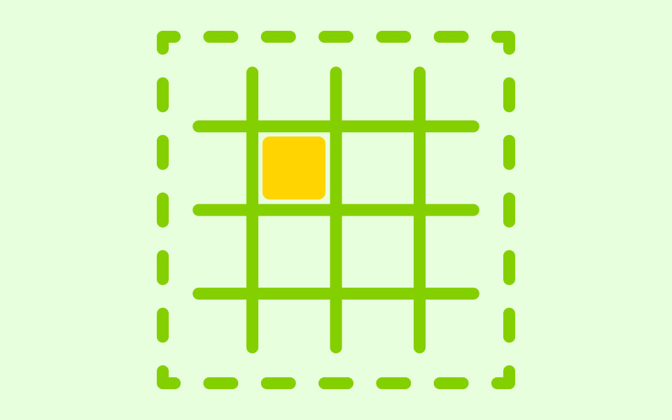
そして最も大事なのが、-ms-grid-columnや-ms-grid-rowを記述するときに
chromeやEdgeなどのブラウザとわけて考える必要があるところです。
chromeやEdgeでは
のような認識ですがIEでは
のようにカウントします。
そのため混乱しないようにそれぞれ異なる数字を振ってあげる必要があります。
みなさんもこれでIE対策してみてくださいね~!