ナックウェブの制作実績でも行った、
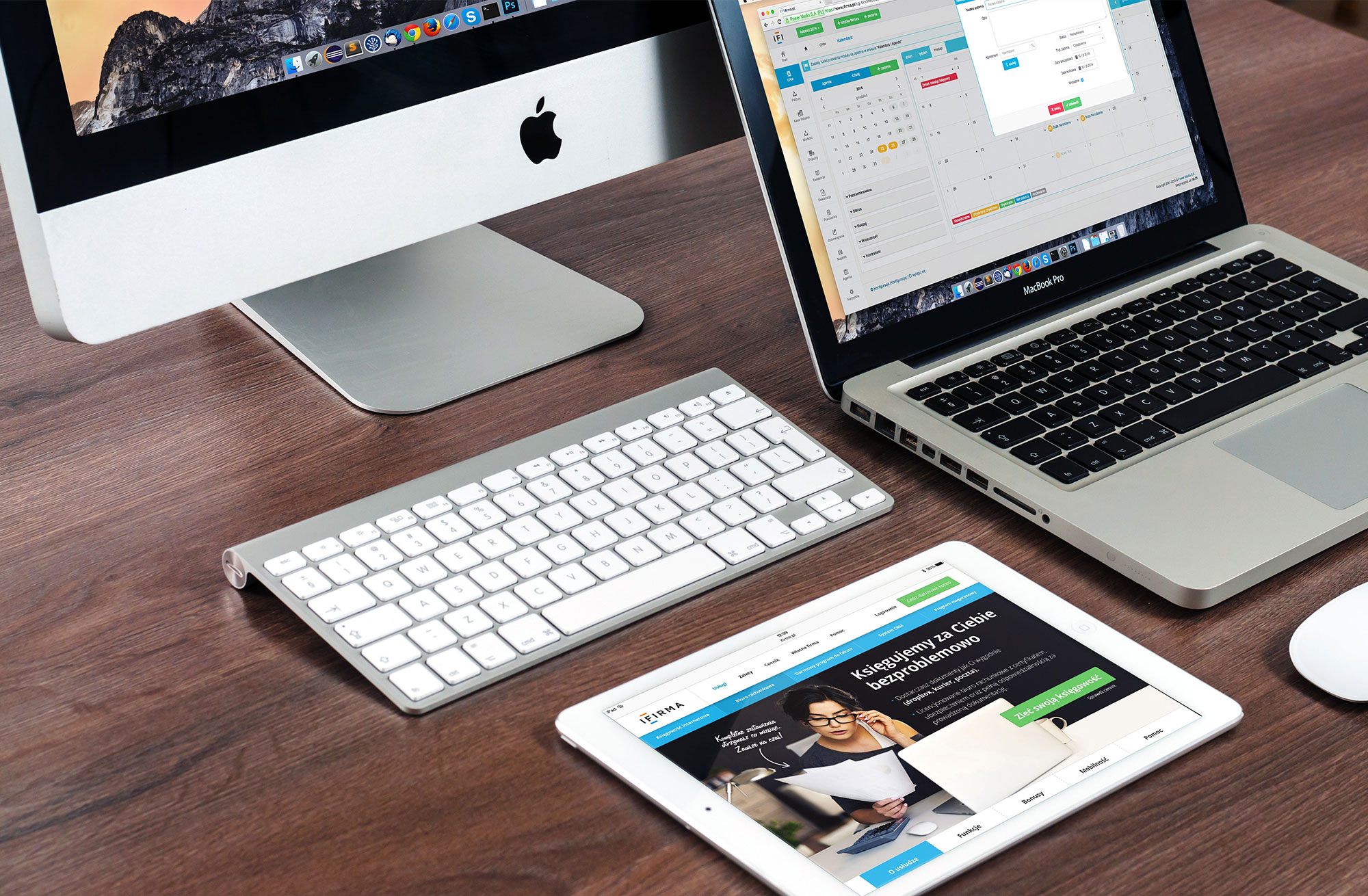
カスタムフィールドを使用して、各端末に画像を設定して、レスポンシブしても対応できるようにする方法をご紹介します。
なかなか「PCやスマホなどの端末にサイト画像を当て込んでレスポンシブ表示する」ってないと思うんですが
依頼されたときに「パッ」とソースが浮かばず、(あれ?この場合どうするのがいいんだろ…)となったので
同じような人にご参考までに!
今回は、各項目正方形という条件があったので(そのほうが作りやすい!)その方法でご紹介します。
ちなみに今回は横3行×追加列というレイアウトになります(*’V’*)
HTMLソースはよくある感じで組んでいってOK!
<div id="showCase">
<!-- 外枠のdiv -->

<article id="designWorks">
<a href="ここに詳細ページへのURL"">
<figure class="pc_img">
<img src="画像URL" alt="画像名">
</figure>
<!-- PCの画像指定 -->
<figure class="sp_img">
<img src="画像URL" alt="画像名">
</figure>
<!-- SPの画像指定 -->
<div>
<h2>サイトタイトル</h2>
<p><span>ジャンル名</span></p>
</div>
</a>
</article>
<!-- articleを複数繰り返す -->

</div>
上記ソース自体はよくある感じのはず。
問題はCSS!レスポンシブでも正方形が崩れないように注意!
#showCase{
  margin: 0 auto;
  width: 96vw;
  display: flex;
  flex-wrap: wrap;
  -webkit-justify-content:flex-start;
  justify-content:flex-start;
  flex-flow: row wrap;
  justify-content: flex-start;
  position: relative;
}


#showCase article{
  display: block;
  width:32vw;
  width : -webkit-calc(32vw - 2px) ;
  width : calc(32vw - 2px) ;
  margin: 1px;
  position: relative;
}

#showCase article&:before {
  content: "";
  display: block;
  padding-top: 100%;
 }

/*↑ここでレスポンシブしても崩れない正方形を指定*/


#showCase article a{
  display: block;
  position: absolute;
  top: 0;
  left: 0;
  width: 100%;
  height: 100%;
  text-align: center;
  padding: 2px;
  box-sizing: border-box;
  -moz-box-sizing: border-box;
  -webkit-box-sizing: border-box;
  -o-box-sizing: border-box;
  -ms-box-sizing: border-box;
  background-image: ここにPCとスマホの端末画像を指定;
  background-repeat: no-repeat;
  background-position: 50% 30%;
  -webkit-background-size: 88%;
  background-size: 88%;
  text-decoration: none;
}

#showCase article a figure{
 display: block;
}

#showCase article a figure img{
  width: 100%;
  position: absolute;
  left: 0;
  top: 0;
}

.pc_img {
  background-repeat: no-repeat;
  background-position: 0;
  position: absolute;
  top: 17.2%;
  left: 12.55%;
  content: "";
  -webkit-background-size: 100%;
  background-size: 100%;
  width: 58%;
  height: 32.6%;
  overflow: hidden;
}

.sp_img {
  background-repeat: no-repeat;
  background-position: 0;
  position: absolute;
  top: 41%;
  right: 10.5%;
  content: "";
  -webkit-background-size: 100%;
  background-size: 100%;
  width: 13.6%;
  height: 24.4%;
  overflow: hidden;
}

#showCase article a figure h2 {
  line-height: 1.75;
  width: 100%;
  position: absolute;
  bottom: 20%;
  text-align: center;
  font-size: 20px;
  margin: 0;
  font-weight: bold;
  width: 100%;
  color: #333;
  margin-top: 20px;
}


#showCase article a figure p{
  margin: 0;
  font-size: 13px;
  text-align: center;
  color: #333;
  width: 100%;
  top: 80%;
}

#showCase article a figure span {
  text-align: center;
  display: block;
  width: 100%;
  display: inline-block;
  padding: 0 5px;
}
上記CSSを当て込めばナックウェブの制作実績なような端末に画像を入れ込んだレイアウトを組むことができます!
みなさんもぜひ試してみてくださいね♪