こんにちは!
今日は表題のとおり、グリッドデザインをするときに便利なjQueryをご紹介します。
公式サイトで紹介されていますので、本家でご確認いただくのもいいと思います。
まずは、下記ソースを任意のjsファイルでアップロードします。
例)grid.js
で、head内にそのほかのJSと一緒に読み込みます。
もちろん
<script src="js/jquery-3.1.0.min.js"></script>
も読み込んでくださいね。
/*
 * jQuery Rect Grid Helper 1.0 - 2017-02-01
 * This plugin help the layout for grid.
 */
jQuery.fn.rectGridHelper = function(options){

  //reset
  var elm = this,
      $elm = jQuery(elm),
      parentWidth = $elm.outerWidth(),
      optionsDefaults = {
        "guide": false,
        "aspectRatio": 0.75,
        "cols": 10,
        "rows": 5,
        "children": [
          {
            "selector": $elm.children()[0],
            "col": 1,
            "row": 1,
            "left": 0,
            "top": 0
          }
        ]
      };

  options = jQuery.extend(optionsDefaults, options);

  var cellWidth = parentWidth / options.cols,
      cellHeight = cellWidth / options.aspectRatio;

  if(options.guide) {
    $elm.css({
      "background-color": "#939393",
      "background-image": "linear-gradient(#d5d5d5 1px, transparent 1px), linear-gradient(90deg, #d5d5d5 1px, transparent 1px)",
      "background-position": "left top",
      "background-size": Math.round(cellWidth) + "px " + Math.round(cellHeight) + "px, " + Math.round(cellWidth) + "px " + Math.round(cellHeight) + "px"
    });
  } else {
    $elm.removeAttr("style");
  }
  $elm.css({
    "height": cellHeight * options.rows + "px",
    "position": "relative"
  });
  for(var i = 0; i < options.children.length; i++) {
    $(options.children[i].selector).css({
      "width": cellWidth * options.children[i].col + "px",
      "height": cellHeight * options.children[i].row + "px",
      "position": "absolute",
      "left": cellWidth * (options.children[i].left - 1),
      "top": cellHeight * (options.children[i].top - 1)
    });
  }
}
上記、読み込んだあとに下記JSで設定を行います。
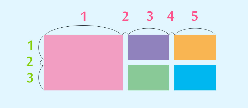
私の場合は、10×4のヒトマスが少し縦長の枠になります。
ここはそれぞれでことなると思うのでおのおので調整してください。
グリッドの間を空けたい場合は、JSでは制御できないので
CSSでborderを入れるなどしてあけることができます。
$(function() {
	runGridLayout();
  $(window).on("load resize", function() {
    runGridLayout();
  });
  function runGridLayout() {
  $("#slide_wrap").rectGridHelper({
      "guide": false, //ガイドを表示
      "aspectRatio": 0.75, //縦横の比率 1未満だと縦長、1以上だと横長
      "cols": 10, //列の数
      "rows": 4, //行の数
      //子要素の設定
      "children": [
        {
          "selector": ".element01",
          "col": 2, //列の数
          "row": 2, //行の数
          "left": 1, //横方向の位置(列の位置)
          "top": 1 //縦方向の位置(行の位置)
        },
        {
          "selector": ".element02",
          "col": 1, //列の数
          "row": 1, //行の数
          "left": 3, //横方向の位置(列の位置)
          "top": 1 //縦方向の位置(行の位置)
        },
        {
          "selector": ".element03",
          "col": 2, //列の数
          "row": 1, //行の数
          "left": 1, //要素3の横方向の位置(列の位置)
          "top": 3 //要素3の縦方向の位置(行の位置)
        }
      ]
    });
 }
});
HTMLは下記になります。
基本的にDIVでもULでも囲むものはなんでもOKです。
aタグも使えます!
 <div id="slide_wrap">
        <ul>
        	<li class="element01">
				<a href="#">
					<img src="images/index/01.jpg" alt="">
				</a>
			</li>
        	<li class="element02">
				<a href="#">
					<img src="images/index/02.jpg" alt="">
				</a>
			</li>
        	<li class="element03">
				<a href="#">
					<img src="images/index/03.jpg" alt="">
				</a>
			</li>
		 </ul>
      </div>
グリッドデザインするときは結構便利ですので皆さんもぜひ使ってみてください!