今回はCSSだけで Horizontal Accordionを作ってみました。
まだ納得いってない箇所もところどころあるのですが、まあ基本部分は実装できているのでいいのではないかと思います。
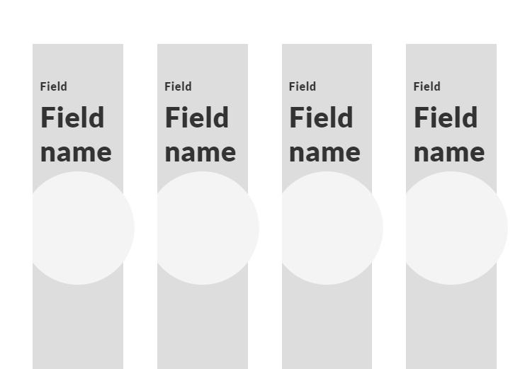
まずはデモから!
hoverするとコンテンツの幅が広がった文章が表示されます。
See the Pen
Horizontal Accordion by sayuri (@giraffeweb)
on CodePen.0
ではソースコードから。
<section id="advantageList">
    <h2><span class="en">Fields of business</span></h2>
    <div class="largeInner flex">
      <article>
            <a class="flex fw" href="">
               <div class="first">
                 <span>Field</span>
                 <h3>Field name</h3>
                 <picture>
                    <source srcset="" media="(max-width: 800px)">
                    <source srcset="" media="(min-width: 800px)">
                    <img src="https://drive.google.com/uc?export=view&id=1gDzw4WrNHn7b1D6ClRBxs8iD34roL6MW" alt="">
                </picture>
              </div>
              <div class="seconds flex">
                <p>A brief description will be included here.</p>
              </div>
            </a>
        </article>
     //あとは繰り返し
    </div>
</section>
CSSは以下のような感じです。
最初から表示させておく部分と、hoverしたときに表示したい箇所をわけて指示するといい感じになりますよ!
#advantageList {
    padding: 1em 0;
    h2 {
        font-size: 2em;
        padding: 2em 0;
        text-align: center;
        color: $red;
    }
    .largeInner {
       overflow: hidden;
        article {
          width: calc(100% / 7 - .75em);
          height: 600px;
          margin-right: 1em;
          -webkit-transition: all 0.4s ease-in-out;
          -webkit-transition-delay: 0.1s;
          transition: all 0.4s ease-in-out 0.1s;
          overflow: hidden;
           &:hover {
              width: 80%;
             a {
               &:before {
                 width: 100%;
               }
             }
            }
            a {
              width: 100%;
              height: 100%;
              position: relative;
                &:before {
                    content: "";
                    width: 80%;
                    height: 100%;
                    position: absolute;
                    left: 0;
                    top: 0;
                    z-index: -1;
                  -webkit-transition: all 0.4s ease-in-out;
                  -webkit-transition-delay: 0.1s;
                  transition: all 0.4s ease-in-out 0.1s;
                  background-color: #ddd;
                }
                .first {
                  position: relative;
                  padding: 50px 0 0 10px;
                  height: 100%;
                  width: 100%;
                  max-width: 230px;
                  picture {
                    width: 100%;
                    max-width: 300px;
                    margin: auto;
                    display: block;
                    position: absolute;
                    left: -10%;
                    top: 30%;
                  }
                  h3 {
                      font-size: 2.5em;
                      margin: 10px 0;
                    }
                    span {
                        font-weight: 600;
                    }
                }
                .seconds {
                  width: calc(100% - 230px);
                  max-width: 500px;
                  padding: 0 3em;
                  //-webkit-transition: all 0.4s ease-in-out;
                  //-webkit-transition-delay: 0.1s;
                  //transition: all 0.4s ease-in-out 0.1s;
                  flex-direction: column;
                  align-items: center;
                  justify-content: center;
                  p {
                      font-size: 1.6em;
                    }
                }
            }
        }
    }
}
みなさんもぜひお試しあれ!