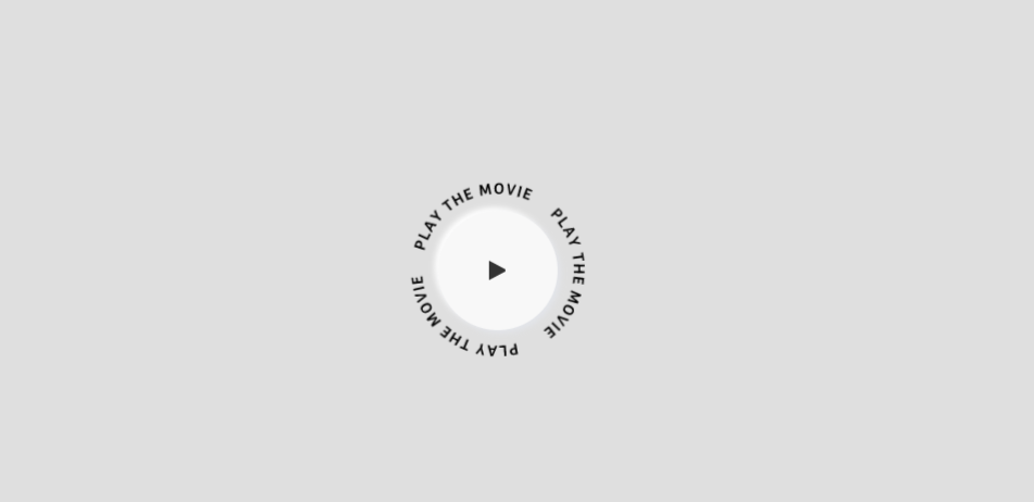
今日はタイトルの通りCSSアニメーションで図形のまわりをまわる文字を作成してみました。
文字自体はSVGで作成しています。
早速デモから!
See the Pen
CSS animation by sayuri (@giraffeweb)
on CodePen.0
ソースをそれぞれ説明していきます。
HTMLはさっくりしたものです。
<div id="movieBtn">
  <div id="playMovie">
  </div>
</div>
今回はJSは使用してません。
SCSSなので変数で色と丸と上下左右50%だけ指定してます。
$red: #FF0002;
@mixin vertical-align {
 position: absolute;
 left: 50%;
  top: 50%;
 -webkit-transform: translate(-50%,-50%);
 -moz-transform: translate(-50%,-50%);
 -ms-transform: translate(-50%,-50%);
 -o-transform: translate(-50%,-50%);
 transform: translate(-50%,-50%);
}

@mixin border-radius-per($radius) {
  -webkit-border-radius: $radius;
     -moz-border-radius: $radius;
          border-radius: $radius;
}
ボタンのまわりをまわっている文字部分。
before要素に背景としてSVGで画像をいれてます。
#movieBtn {
 position: relative;
 width: 150px;
 height: 150px;
  &:before {
      position: absolute;
      top: 0;
      left: 0;
      display: block;
      content: "";
      background: url("https://drive.google.com/ucexport=view&id=14Begz2OHBIbkWEre6gPrgEvN9AYrT04D") no-repeat 50%/contain;
      width: 100%;
      height: 100%;
      animation: circleRing 20s linear infinite;
      border-radius: 20px;
  }
}
白背景のボタン部分です。
ここはみなさん適宜応じて修正してください。
参考程度に見てもらえるとうれしいです。
#playMovie {
   width: 100px;
   height: 100px;
   z-index: 50;
   box-shadow: 3px 3px 5px #e3e5ea, -3px -3px 5px #fff;
   background-color: #f8f8f8;
   cursor: pointer;
   @include border-radius-per(50%);
   @include vertical-align();
   &:before {
      content: "";
      display: block;
      width: 0;
      height: 0;
      border-color: transparent transparent transparent #333;
      border-style: solid;
      border-width: 8px 0 8px 14px;
      z-index: 10;
      position: absolute;
      top: 0;
      left: 0;
      right: 0;
      bottom: 0;
      margin: auto;
    }
    &:after {
      position: absolute;
      top: 0;
      left: 0;
      right: 0;
      bottom: 0;
      content: "";
      background-color: $red;
      transition: transform .4s cubic-bezier(.215,.61,.355,1);
      border-radius: 50%;
      transform: scale(0);
    }
    &:hover {
      &:before {
        border-color: transparent transparent transparent #fff;
      }
      &:after {
        transform: scale(1);
      }
    }
  }
こんなかんじです!
結構簡単におしゃれなボタンがつくれますよね!
みなさんもぜひ試してみてくださいね。