LP作成時に、上部に固定していたheaderを一時的にページ内リンクに変更したく、エンジニアさんに相談したところ実装してくれたのでその方法をご紹介します。
まずはデモから!
See the Pen
by sayuri (@giraffeweb)
on CodePen.0
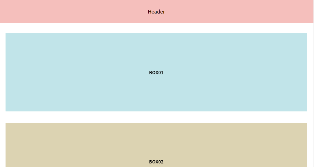
こんな感じでボックス2になると、別のナビゲーションが表示されます。
また、ボックス6までいくと、もとのヘッダーに戻ります。
HTMLは以下のような感じ。HTML自体はシンプルです。
<!-- googlefont -->
<link rel="preconnect" href="https://fonts.googleapis.com">
<link href="https://fonts.googleapis.com/css?family=Noto+Sans+JP:400,700|Poppins&display=swap" rel="stylesheet">
<!-- googlefont -->

<header>
  <p>Header</p>
</header>

<section id="boxFirst">
  <p>BOX01</p>
</section>

<section id="boxSecond">
  <p>BOX02</p>
</section>

<section id="boxThird">
  <p>BOX03</p>
</section>

<section id="boxForth">
  <p>BOX04</p>
</section>

<section id="boxFifth">
  <p>BOX05</p>
</section>

<section id="boxSix">
  <p>BOX06</p>
</section>

<nav id="menu">
  <p>NAV</p>
</nav>

<footer>
  <p>Footer</p>
</footer>
CSSは参考程度です。
みなさんの好きなように変更してください。
* {
  margin: 0;
  padding: 0;
  font-family: 'Noto Sans JP', "ヒラギノ角ゴ ProN W3", "メイリオ", Meiryo, "MS Pゴシック", "MS PGothic", sans-serif;
  -webkit-text-size-adjust: 100%;
  text-size-adjust: 100%;
  font-weight: normal;
  letter-spacing: -.00001em;
  word-wrap: break-word;
}

header,footer,nav {
  width: 100%;
  padding: 1.6em 0;
  text-align: center;
  font-size: 18px;
  font-weight: bold;
  background-color: #f6bfbc;
}

header,nav {
  position: fixed;
  top: 0;
  left: 0;
  z-index: 100;
  height: 60x;
}

nav {
  display: none;
  background-color: #658791;
}

section {
  padding: 8em 0;
  width: 96%;
  margin: 0 auto 40px auto;
  &#boxFirst {
    margin-top: 120px;
    background-color: #c1e4e9;
  }
  &#boxSecond {
    background-color: #dcd3b2;
  }
  &#boxThird {
    background-color: #f3bf88;
  }
  &#boxForth {
    background-color: #eebbcb;
  }
  &#boxFifth {
    background-color: #deb068;
  }
  &#boxSix {
    background-color: #f5e56b;
  }
  p {
    text-align: center;
    font-weight: bold;
  }
}
で、問題のJSです。
今回はタブレットの縦以上にのみ適応するようにしています。
端末サイズ関係ない場合は「if ($(window).width() > 800) {}」を削除してください。
    $(function(){
      if ($(window).width() > 800) { // SP以外でのみ実行
        $(window).scroll(function (){
            let target1 = $('#boxSecond').offset().top;
            let target2 = $('#boxSix').offset().top;

            let scroll = $(window).scrollTop();
            let windowHeight = $(window).height();

            // 特定の区間のみヘッダーを差し替える
            if (scroll > target1 && scroll < target2){
              $("#menu").slideDown();
              $("header").slideUp();
            } else {
              $("#menu").slideUp();
              $("header").slideDown();
            }
        });
      }
    });
targetで開始するブロックと終了するブロックのIDを指定します。
あとは、headerと表示をいれかえるメニューのIDを指定すればOKです。
ちなみにslideで表示するのがいやな場合は
slideDownをfadeInに、slideUpをfadeOutにするとふわっと表示、非表示をすることができますよ。
みなさんもぜひお試しください。